21st Century Cyber Charter School
21st Century Cyber Charter School is the leading online charter school in Pennsylvania. They needed a digital presence that would improve usability, success metrics, and match their commitment to excellence.
Rethinking a Marketing Website in Response to Analytics
21st Century Cyber Charter School (21CCCS) is Pennsylvania’s number one charter school for online learning. The school provides fully remote learning options for students in grades 6–12. It boasts the state’s best academic track record out of all cyber school options.
Framing the Problem
21CCCS had engaged the agency for advertising, which yielded excellent results. However, the rise in site visits from ads unveiled new issues. While these metrics don’t tell the whole story, it was enough to elicit inquiry.
Form completion rates lagged behind expectations
The time users spent on page did not increase despite routine content updates
Users had difficulty navigating the site, resulting in phone calls and abandoned pages
Defining a Solution
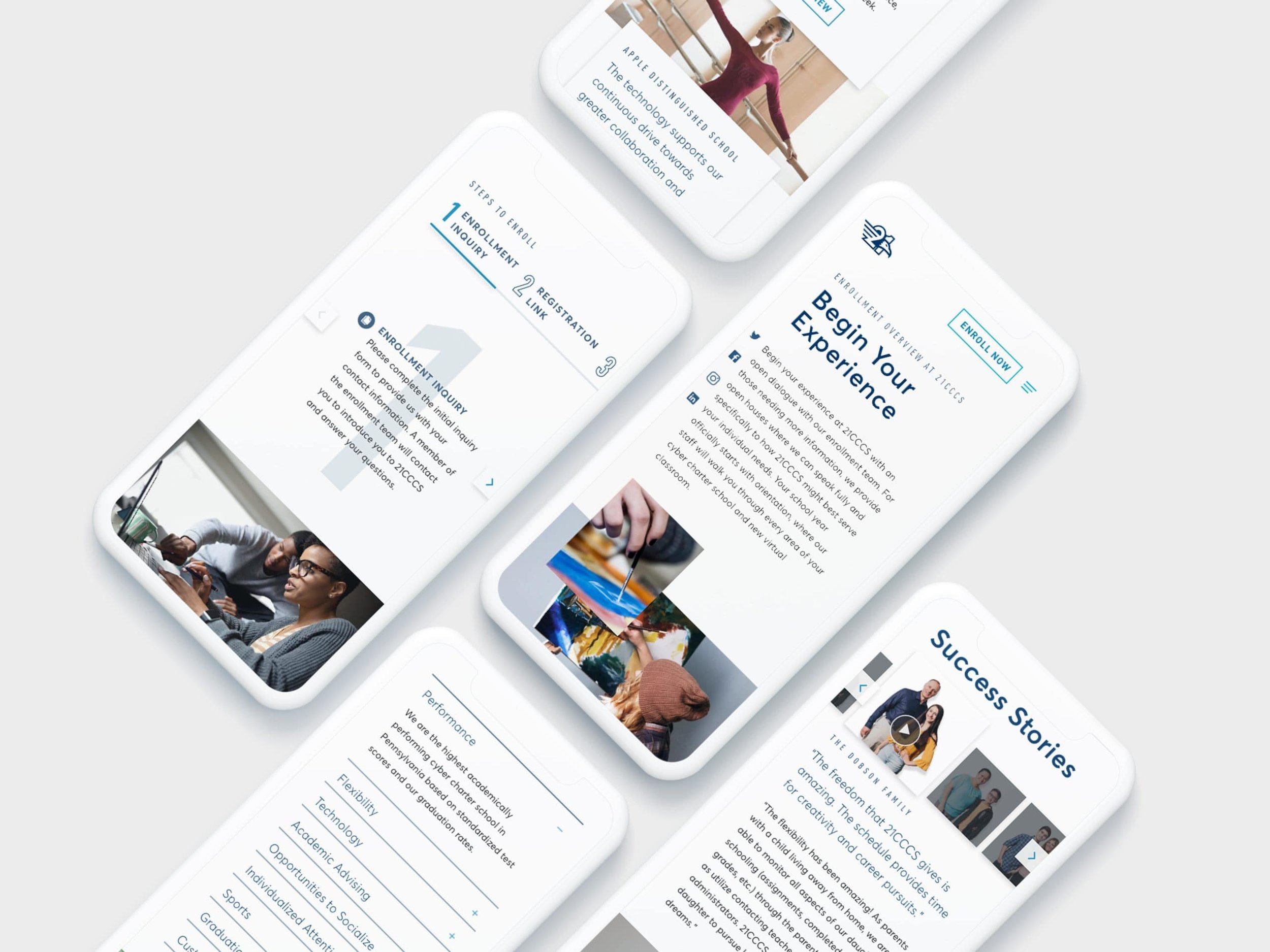
A combination of UX and UI improvements were recommended, resulting in a redesign of the entire site.
The existing enrollment form was revised to become a gated form, to boost completion rates and capture
Navigation interactions were improved to drive target user groups toward the most important information on a content heavy site
Interface design was improved to more clearly display this content and support site navigation
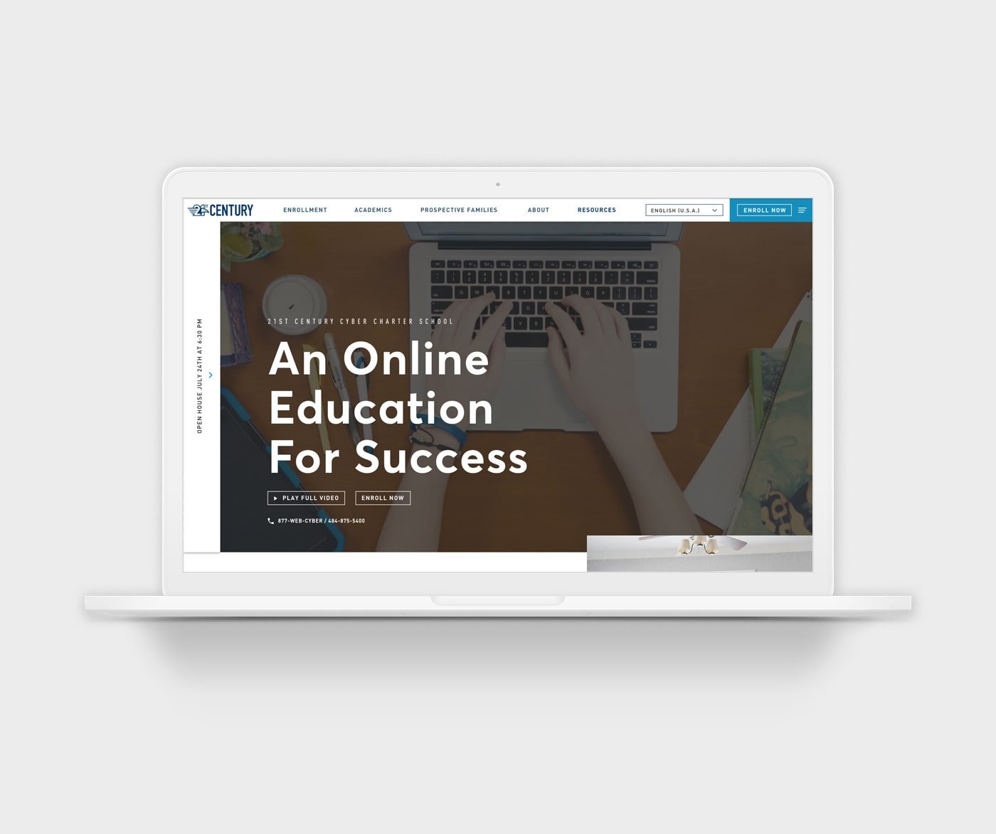
Visual design was elevated to capture attention, bringing the brand to life
Interactive elements were added to boost time spent on page and relate to campaigns already receiving the attention of target user groups in market
Project Role: UX / UI Design, Project Lead
Deliverables: Responsive Web Design
Creative Director: Adam Englehart
Team: Emily Higgins, Demetrius Burgess
Client: 21st Century Cyber Charter School
Vertical: Education, Non-profit
Created at Neff
Cutting Out the Clutter
The content organization would be the underpinning of experience improvements to create intuitive navigation and increase engagement. It began by mapping the current site to create alignment on constraints and objectives. After collaborating with the client to determine the importance of information, this phase produced an approved sitemap.
Original Sitemap

A map of 21CCCS’s existing site. Pages highlighted in orange were removed or had content condensed.
Constraints
Most copy could not be cut, only reorganized
The site contained a high volume of content
Some new content must be added to an already large site
Proposed Sitemap

The new Proposed Sitemap eliminated a confusing secondary menu and reduced the total amount of pages by 33%.
Objectives
Group content under succinct, descriptive labels
Combine sections with similar content or low content densities
Remove duplicate pages that are misleading or repetitious
Organizing the Content
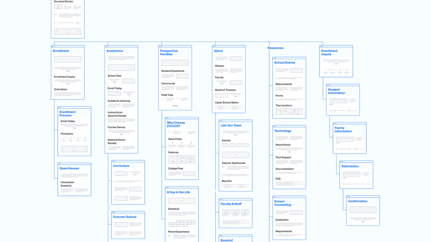
Low-fidelity wireframes were created to validate the proposed sitemap.

High-fidelity wireframes for the homepage and academics pages.
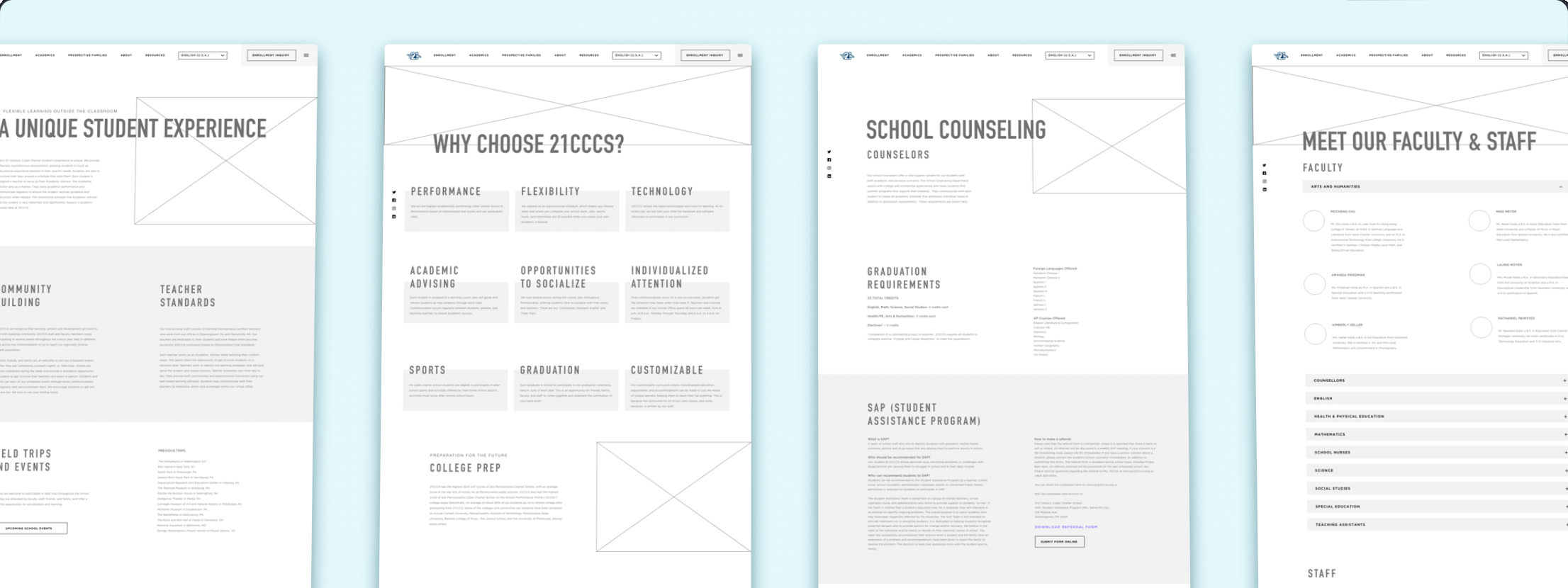
While each high-fidelity wireframe used consistent styles, a variety of components were created to display the content.
Interface Design

The client requested an area to place announcements that would be seen immediately on the homepage. The old site used a sticky top sheet to contain the entire message, but could not appropriately accommodate the lengthy character count without obscuring key visuals. This new design uses an interactive flyout menu on the left-hand side of the hero to solve the issue.

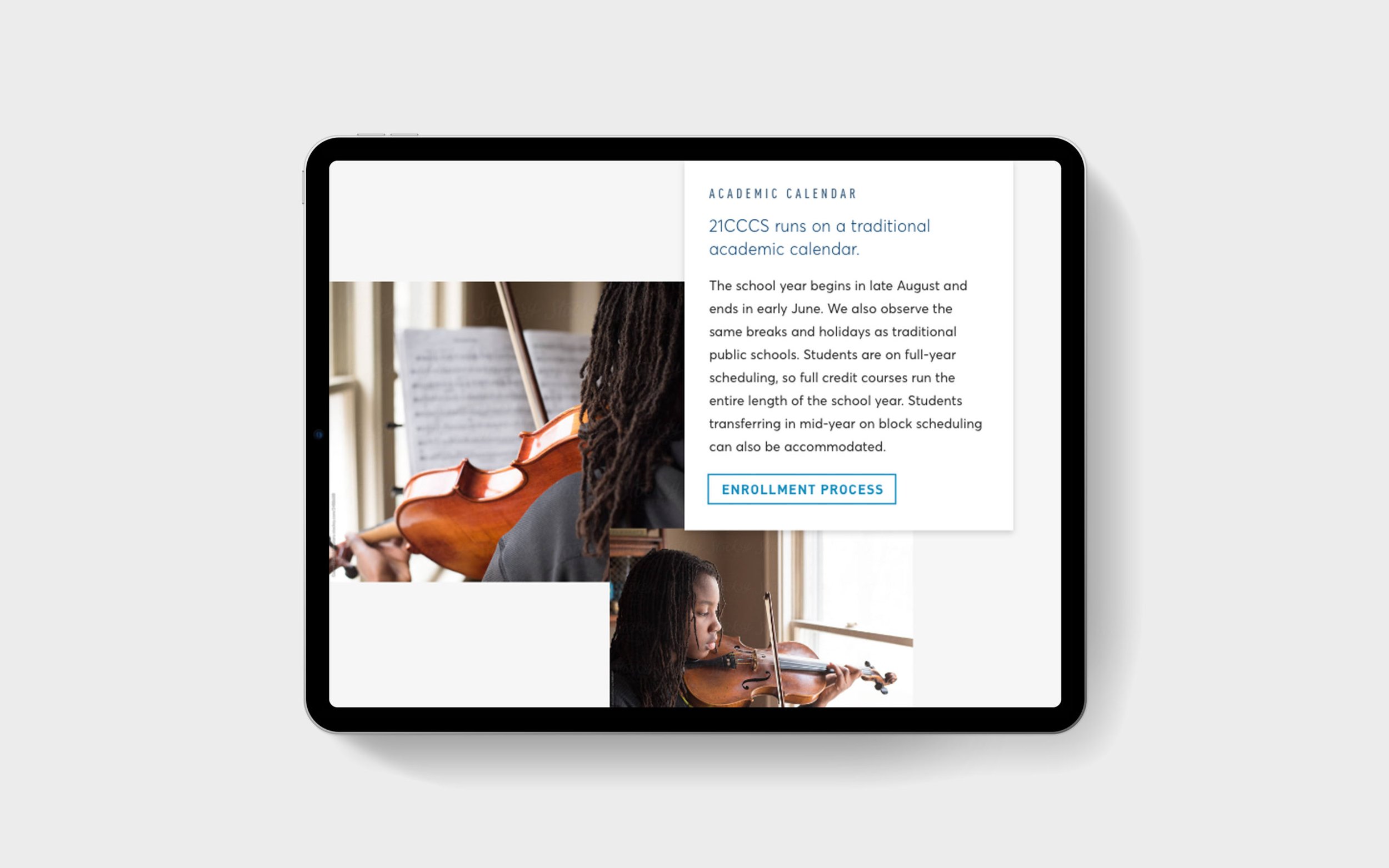
Homepage cards contain image and type pairings. Images were selected to describe dense copy and ease cognitive load, while adding interest for viewers.

Because many of their students chose cyber school due to demanding schedules of professional sports or artistic pursuits, it was important to showcase this subject matter through imagery on the website. A marketing objective was to help potential applicants to envision themselves as students.
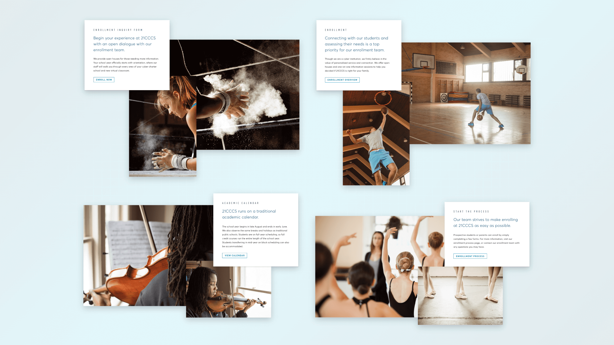
Images of the same subject, taken from different angles, were paired together to build a dynamic identity for the website. These selections were interspersed throughout key pages on the website.

I animated the existing logo to be used during the loading experience. Lottie allowed me to export a .json file for our developer to trigger.

We had the opportunity to spice up the experience by allowing users to listen to recorded testimonials from students and their families. This was achieved through leveraging existing radio spots.
The ability to receive information through multiple delivery methods increases comprehension, reduces fatigue, and provides a stronger emotional connection.
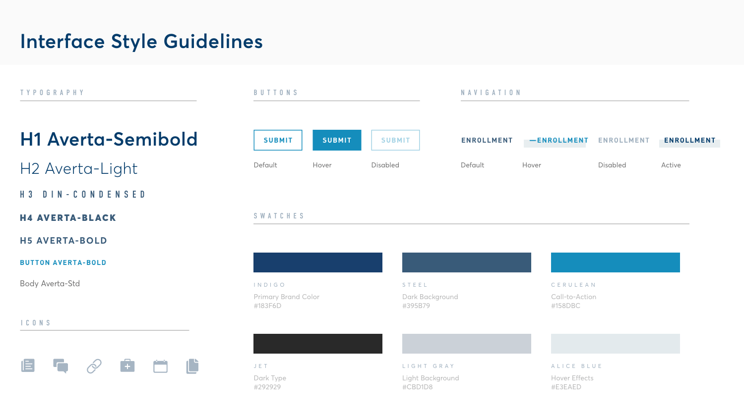
Basic website style guidelines expanded upon the existing brand guidelines.
The prototype animation helped validate the feasibility of my design with the development team.

